CSS Grid Introduction
Try to resize browser window to see changes:
Try this code ❯
What is CSS Grid?
The CSS Grid layout brings a two-dimensional layout tool to the web, with the ability to place items in rows and columns.
The importance of grids in modern web design is high so this new spec solves a lot of age-old problems with laying out elements in-browser.
CSS Grid Layout
The CSS grid layout contains of a parent element, with one or more child elements(items).
Example
<div class="grid-container">
  <div class="grid-item">1</div>
  <div class="grid-item">2</div>
  <div class="grid-item">3</div>
  <div class="grid-item">4</div>
  <div class="grid-item">5</div>
  <div class="grid-item">6</div>
</div>The CSS Grid Display Property
The CSS grid container establishes a new grid formatting context for its contents.
This is the same as establishing a block formatting context, except that grid layout is used instead of block layout: floats do not intrude into the grid container, and the grid container’s margins do not collapse with the margins of its contents.
The contents of a grid container are laid out into a grid, with grid lines forming the boundaries of each grid items’ containing block.
The overflow property applies to grid containers.
Grid containers are not block containers, and so some properties that were designed with the assumption of block layout don’t apply in the context of grid layout.
Syntax:
display: grid | inline-grid;- grid - It sets an element to generate a block-level grid container box.
- inline-grid - It sets an element to generate an inline-level grid container box.
Example
.grid-container {
  display: grid;
}If an element’s specified display is inline-grid and the element is floated or absolutely positioned, the computed value of display is grid.
Defining the grid
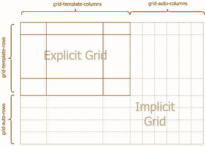
Explicit grid
The following three properties together define the explicit grid of a grid container:
- grid-template-rows,
- grid-template-columns, and
- grid-template-areas
Note - The final grid may end up larger due to grid items placed outside the explicit grid; in this case implicit tracks will be created, these implicit tracks will be sized by the grid-auto-rows and grid-auto-columns properties.
The size of the explicit grid is determined by the larger of the number of rows/columns defined by grid-template-areas and the number of rows/columns sized by grid-template-rows/grid-template-columns.
Any rows/columns defined by grid-template-areas but not sized by grid-template-rows/grid-template-columns take their size from the grid-auto-rows/grid-auto-columns properties.
If these properties don’t define any explicit tracks the explicit grid still contains one grid line in each axis.
Numeric indexes in the grid-placement properties count from the edges of the explicit grid.
Positive indexes count from the start side (starting from 1 for the start-most explicit line), while negative indexes count from the end side (starting from -1 for the end-most explicit line).
The grid and grid-template properties are a shorthands that can be used to set all three explicit grid properties (grid-template-rows, grid-template-columns, and grid-template-areas) at the same time.
The grid shorthand also resets properties controlling the implicit grid, whereas the grid-template property leaves them unchanged.
Implicit grid
The following properties define a fixed number of tracks that form the explicit grid:
- grid-template-rows,
- grid-template-columns, and
- grid-template-areas
When grid items are positioned outside of these bounds, the grid container generates implicit grid tracks by adding implicit grid lines to the grid.
These lines together with the explicit grid form the implicit grid. The grid-auto-rows and grid-auto-columns properties size these implicit grid tracks.
The grid-auto-flow property controls auto-placement of grid items without an explicit position.
Once the explicit grid is filled (or if there is no explicit grid) auto-placement will also cause the generation of implicit grid tracks.
The grid shorthand property can set the implicit grid properties (grid-auto-flow, grid-auto-rows, and grid-auto-columns) together with the explicit grid properties in a single declaration.
Difference between Implicit grid and Explicit grid:
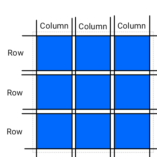
Column and Rows
The vertical lines of grid items are columns and horizontal lines of grid items are rows.
You learn more about CSS grid column and rows in CSS Grid Containers chapter.
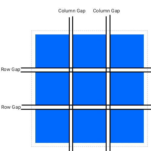
Grid Gaps
The spaces between column/row are grid gaps.
To know more about grid gap see CSS Grid Spacing chapter.
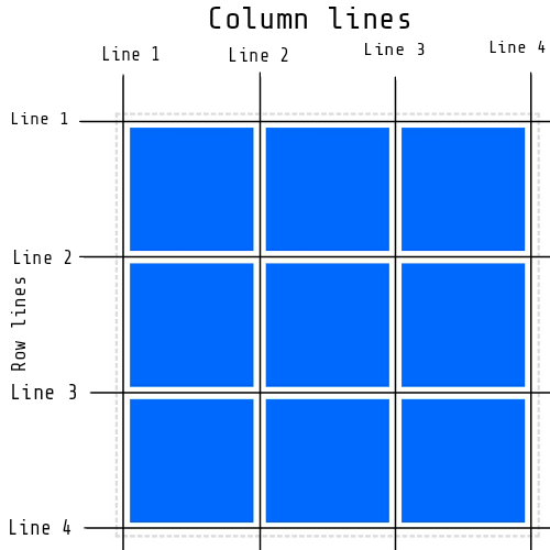
Grid Line
The lines between rows/columns are called row/column lines.
You learn more about grid line in CSS Grid Items chapter.
Glossary
- Grid Parent - The direct parent to the elements that will be arranged into grid cell.
- Grid Children - The direct child elements to the grid parent.
- Grid Cells - The spaces defined by the intersections of grid columns and grid rows, similar to the cells in a spreadsheet (grid children are arranged into these).
- Grid Lines - Numbered from left to right and top to bottom, respectively (it is important for positioning individual grid children into specific grid cells).
Notes:
- float and clear have no effect on a grid item. However, the float property still affects the computed value of display on children of a grid container, as this occurs before grid items are determined.
- vertical-align has no effect on a grid item.
- the ::first-line and ::first-letter pseudo-elements do not apply to grid containers, and grid containers do not contribute a first formatted line or first letter to their ancestors.
All CSS Grid Properties
| Property | Description |
|---|---|
| align-content | Sets the distribution of space between and around content items along a flexbox's cross-axis or a grid's block axis. |
| align-items | Sets the align-self value on all direct children as a group. |
| align-self | Specifies the default alignment for items within the flex container. |
| column-gap | Defines the gap between columns in a multicolumn text flow. |
| gap | A shorthand property for the row-gap and the column-gap properties. |
| grid | A shorthand property for the grid-template-rows, grid-template-columns, grid-template-areas, grid-auto-rows, grid-auto-columns, and the grid-auto-flow properties. |
| grid-area | Specifies a grid item's size and location within a grid by contributing a line, a span, or nothing (automatic) to its grid placement, thereby specifying the edges of its grid area. |
| grid-auto-columns | Specifies the size of an implicitly-created grid column track or pattern of tracks. |
| grid-auto-flow | Specifies how auto-placed items are inserted in the grid. |
| grid-auto-rows | Specifies the size of an implicitly-created grid row track or pattern of tracks. |
| grid-column | A shorthand property specifies a grid item's size and location within a grid column by contributing a line, a span, or nothing (automatic) to its grid placement, thereby specifying the inline-start and inline-end edge of its grid area. |
| grid-column-end | specifies a grid item's end position within the grid column by contributing a line, a span, or nothing (automatic) to its grid placement, thereby specifying the block-end edge of its grid area. |
| grid-column-gap | specifies the size of the gap between the columns in a grid layout. |
| grid-column-start | specifies a grid item's start position within the grid column by contributing a line, a span, or nothing (automatic) to its grid placement. This start position defines the block-start edge of the grid area. |
| grid-gap | A shorthand property specifies a grid item's size and location within the grid row by contributing a line, a span, or nothing (automatic) to its grid placement, thereby specifying the inline-start and inline-end edge of its grid area. |
| grid-row | A shorthand specifies the size of an implicitly-created grid row track or pattern of tracks. |
| grid-row-end | Specifies a grid item's end position within the grid row by contributing a line, a span, or nothing (automatic) to its grid placement, thereby specifying the inline-end edge of its grid area. |
| grid-row-gap | specifies the size of the gap between the rows in a grid layout. |
| grid-row-start | Specifies a grid item's start position within the grid row by contributing a line, a span, or nothing (automatic) to its grid placement, thereby specifying the inline-start edge of its grid area. |
| grid-template | A shorthand property for defining grid columns, rows, and areas. |
| grid-template-areas | Specifies named grid areas, establishing the cells in the grid and assigning them names. |
| grid-template-columns | Defines the line names and track sizing functions of the grid columns. |
| grid-template-rows | Defines the line names and track sizing functions of the grid rows. |
| justify-content | Specifies the alignment between the items inside a flexible container when the items do not use all available space. |
| justify-items | sets the way of justifying each box along the appropriate axis. |
| justify-self | Sets the way a box is justified inside its alignment container along the appropriate axis. |
| row-gap | sets the size of the gap (gutter) between an element's rows. |