CSS Grid Containers
The grid-template-columns property specifies the track list for the grid’s columns, while grid-template-rows specifies the track list for the grid’s rows.
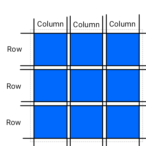
grid-template-columns
The grid-template-columns property defines the line names and track sizing functions of the grid columns.
Example
.grid-container {
  display: grid;
  grid-template-columns: 100px 100px auto;
}grid-template-rows
The grid-template-rows property defines the line names and track sizing functions of the grid rows.
Example
.grid-container {
  display: grid;
  grid-template-rows: 100px 100px 100px 200px 200px auto;
}grid-auto-columns and grid-auto-rows
If a grid item is positioned into a row or column that is not explicitly sized by grid-template-rows or grid-template-columns, implicit grid tracks are created to hold it.
This can happen either by explicitly positioning into a row or column that is out of range, or by the auto-placement algorithm creating additional rows or columns.
The grid-auto-columns and grid-auto-rows properties specify the size of such implicitly-created tracks.
Note - If multiple track sizes are given, the pattern is repeated as necessary to find the size of the implicit tracks.
grid-auto-rows:
Example
.grid-container {
  display: grid;
  grid-template-rows: 50px;
  grid-auto-rows: 100px;
}grid-auto-column:
Example
.grid-container {
  display: grid;
  grid-template-columns: 50px;
  grid-auto-columns: 75px 2fr 300px;
  grid-auto-flow: column;
}grid-auto-flow
The grid-auto-flow controls how the auto-placement algorithm works, specifying exactly how auto-placed items get flowed into the grid.
Example
.grid-container {
  display: grid;
  grid-template-columns: repeat(4, 1fr);
  grid-template-rows: repeat(4, 1fr);
  grid-auto-flow: row;
}

.item3 {
  grid-column:span 3;
  grid-row:span 3;
}grid-template-areas
The grid-template-area specifies named grid areas, which are not associated with any particular grid item, but can be referenced from the grid-placement properties.
The syntax of the grid-template-areas property also provides a visualization of the structure of the grid, making the overall layout of the grid container easier to understand.
Example
.grid-container {
  display: grid;
  grid-template-areas:
  "header header header"
  "nav nav nav"
  "column1 column2 column3"
  "footer footer footer";
}

.item1 { grid-area: header; }
.item2 { grid-area: nav; }
.item3 { grid-area: column1; }
.item4 { grid-area: column2; }
.item5 { grid-area: column3; }
.item6 { grid-area: footer; }grid-template
The grid-template property is a shorthand for setting grid-template-columns, grid-template-rows, and grid-template-areas in a single declaration.
It has several distinct syntax forms the following is simplified:
grid-template: none|grid-template-rows / grid-template-columns|grid-template-areas;Note - The grid shorthand accepts the same syntax, but also resets the implicit grid properties to their initial values.
Example
.grid-container {
  display: grid;
  border: 2px dashed #ddd;
  padding: 10px;
  grid-gap: 10px;
  grid-template: auto 1fr / auto 1fr;
}